Guests & invitations
Wedding invitation wording that gives guests clear answers
Original examples for invitations, dress codes, RSVP reminders, access information and changed plans.
Original design concept · A styling reference
Invitations & paper
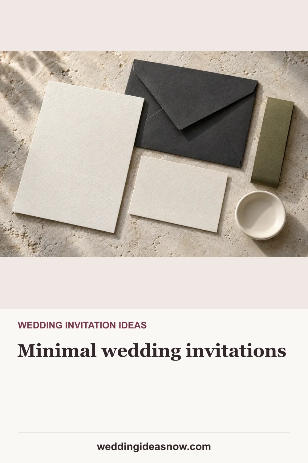
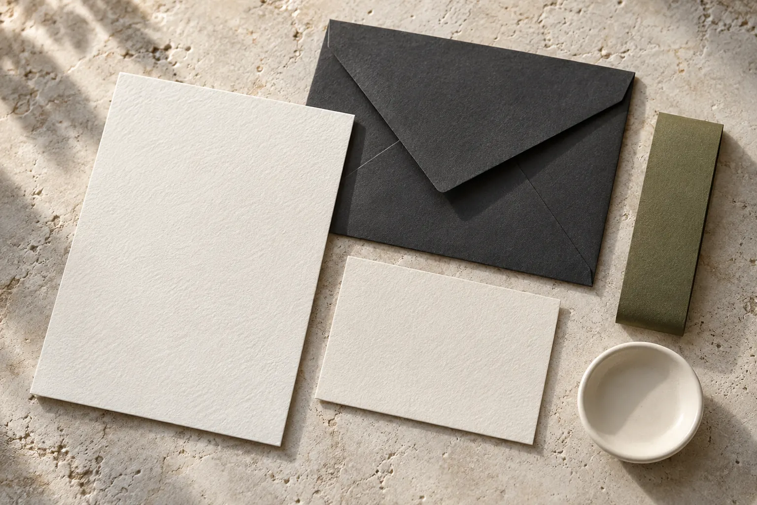
A paper material study pairs crisp ivory cards with a dark envelope and a slim olive band. The linked guide supplies readable wording.
Save it to your Wedding board in this browser. Add notes, move it to another board and compare it in My saved plan.
Download Pin image · 1000 × 1500 JPEG
Crisp edges and a quiet paper palette
A paper material study pairs crisp ivory cards with a dark envelope and a slim olive band. The linked guide supplies readable wording.

What I want to borrow: This direction leaves the typography and information order to do most of the work. Strong paper contrast connects easily to a formal or modern room.
Adaptation to discuss: Use fewer insert pieces where the information can remain clear. Request a printed sample to check contrast, paper feel, envelope fit and the actual mailing cost before ordering.

Questions for our supplier:
• Can every essential detail be read at the chosen type size?
• Will the full suite fit the selected envelope?
• Which details belong on the invitation and which belong on a linked information page?

Scope to confirm: A quiet invitation suite with final sizes, stock, type and all necessary information.
Responsible people: Host and stationery producer; one final proof approver and one mailing owner.
Before confirming: Print a full-size proof to test contrast, address fit, postage and legibility before approving production.
Working example (replace with actuals): Approve one assembled physical proof before the production run; count addressed households, extra hosts’ copies and agreed replacements separately.

Reference: https://weddingideasnow.com/ideas/paper-minimal/
This direction leaves the typography and information order to do most of the work. Strong paper contrast connects easily to a formal or modern room.
Use fewer insert pieces where the information can remain clear. Request a printed sample to check contrast, paper feel, envelope fit and the actual mailing cost before ordering.
Concept imagery illustrates a direction, not a named product, bookable venue or documented event. Confirm actual materials, fit, measurements and service with your chosen provider.
Guests & invitations
Original examples for invitations, dress codes, RSVP reminders, access information and changed plans.
Guests & invitations
Adapt these complete answers for travel, timing, children, gifts, food and changes, then test the guest journey.

Invitations & paper
A similar blue can feel relaxed with matte linen and clay, or more formal with smooth satin and pale metal.

Invitations & paper
A botanical border frames a calm center on this paper study; a sage envelope repeats the green.

Invitations & paper
Deckled edges, a translucent layer and a fabric ribbon create a tactile paper direction without relying on printed ornament.