
Original wedding concept
Build an invitation suite that guests can use
Complete original invitation, details and reply examples, with household addressing and a practical print-or-digital decision.
Original design concept · A styling reference
Invitations & paper
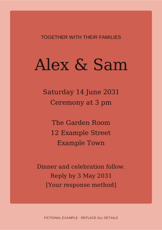
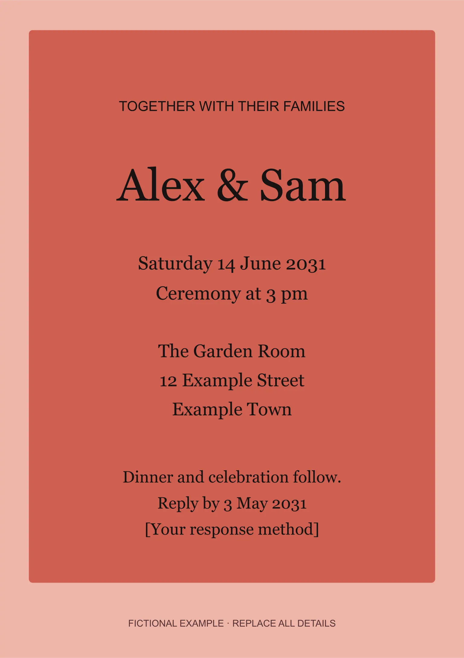
Large serif names sit inside a coral-and-pink invitation with a clear centered hierarchy and generous margins.
Download editable invitation · SVG
Original vector design with fictional example details. Replace every field and approve a finished proof before use.
Save it to your Wedding board in this browser. Add notes, move it to another board and compare it in My saved plan.
Download Pin image · 1000 × 1500 JPEG
Coral blocks with confident type
Large serif names sit inside a coral-and-pink invitation with a clear centered hierarchy and generous margins.

What I want to borrow: Choose a vivid color relationship when you want the invitation to feel expressive without needing a decorative illustration.
Adaptation to discuss: Use one ink color on pale stock if full-color coverage is unsuitable for your print method.

Questions for our supplier:
• Which event or events does this invitation actually cover?
• Are names, address, time, response date and response method correct in every language?
• Has one finished card been proofed and checked with the intended envelope and postal service?

Scope to confirm: Card dimensions, wording, quantity per invited household, envelope, print method and delivery.
Responsible people: One person collects factual corrections; each named host approves their wording; the printer supplies a physical proof.
Before confirming: Print at actual size. Read the smallest text, check contrast, verify event access and test one complete mailed pack.
Working example (replace with actuals): Illustration: 48 invited households plus six agreed spare invitations means 54 packs; guest count is not the invitation-pack count.

Reference: https://weddingideasnow.com/ideas/paper-coral-modern/
Choose a vivid color relationship when you want the invitation to feel expressive without needing a decorative illustration.
Use one ink color on pale stock if full-color coverage is unsuitable for your print method.
Concept imagery illustrates a direction, not a named product, bookable venue or documented event. Confirm actual materials, fit, measurements and service with your chosen provider.
Original wedding concept
Complete original invitation, details and reply examples, with household addressing and a practical print-or-digital decision.
Guests & invitations
Original examples for invitations, dress codes, RSVP reminders, access information and changed plans.

Invitations & paper
A similar blue can feel relaxed with matte linen and clay, or more formal with smooth satin and pale metal.
Invitations & paper
A paper material study pairs crisp ivory cards with a dark envelope and a slim olive band. The linked guide supplies readable wording.

Invitations & paper
A botanical border frames a calm center on this paper study; a sage envelope repeats the green.